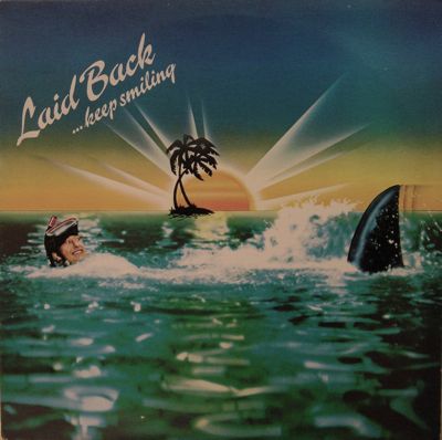
Crap album art isn’t always about the thing itself. Sometimes a merely nauseating album cover can reach dizzying new lows when compared side-by-side to equally barf inducing artwork. Submitted for your approval, all the way from Denmark–the cover of Laid Back’s Keep Smiling album. This isn’t the most rotten thing ever made, but let’s call this artwork…uninspired:
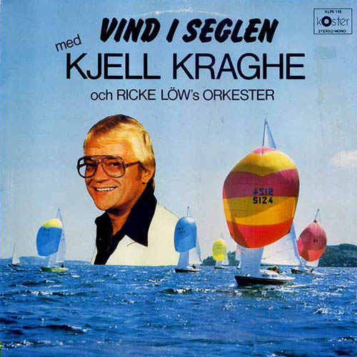
Now compare it to the utterly goofy and craptacular cover for this Swedish nonsense– Kjell Kraghe’s Vind I Seglen. This album cover takes the seafaring them to a similarly fucktarded new low. We’re faced with a serious chicken-and-egg question here. Which wretched cover came first? Was this some kind of harmonic convergence of dumbass graphic design? Or was somebody thinking, “No way is that OTHER windmill-and-wooden-shoes country going to show US up in the dumbass graphics department!”
This album cover reminds me of Beavis and Butthead episode where Butthead delivers a stunning critique of a bad 90s music video by merely uttering the phrase, “Look at his FACE!” That’s all we really need to say here, isn’t it? Except those two sails placed so perfectly in symmetry next to this hambone Ricky Schroeder lookalike makes it appear this guy has some kind of freakish protruberances connected to that suit of his.
So perhaps these are both, on their own, merely lame-o record covers. But viewed side by side they give me the horrors. We know Sweden and Denmark are capable of better than this…but then again, we haven’t even started looking at the bad death metal album covers from these two countries. Just you wait, this stuff looks tame (well, it IS tame) by comparison.

