Tag Archives: bad album art

WTF: Ted Nugent Love Grenade

ted nugent love grenade album cover

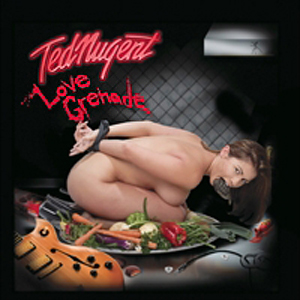
Ted Nugent’s cover for the 2007 greatest hits collection, Love Grenade, isn’t just a wretched exercise in horny teenager-style cartooning, it’s also wildly offensive! Just look at how she’s depicted abusing that innocent hand grenade.

Seriously though, rampaging sexism aside, Love Grenade wins top marks–it’s a true accomplishment to  bewilder AND register as blindingly stupid at the same time. A naked woman bound on a food tray with…a grenade in her mouth? That IS a grenade, right? It’s not an under-ripe avocado? Or maybe it’s Ted Nugent’s wallet, fat with all that cash he’s making off another collection of reheated twaddle.

I’m trying hard to figure out what The Nuge is trying to say here–aside from “Hey Kids, here’s a REALLY DUMB record by MEEEEEEE!” And the track listing does nothing to dispel that notion. When you’ve got songs like “Bridge Over Troubled Daughters” and “Broadside” (get it? Huh huh, heh heh, BROAD side…heh heh huh huh) you know you’re not dealing with a Rhodes scholar here.

Whatever happened to the good old days when long haired dorks with guitars sang about SATAN? Continue reading WTF: Ted Nugent Love Grenade
WTF: The Sexual Gospel

wtf bad album art jesus use me

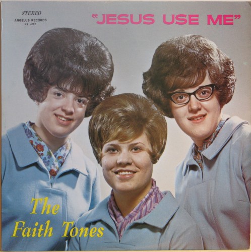
There is no nice way to say this. Our latest entry in the WTF bad album cover artwork series has so much wrong with it that the LEAST of this record’s worries are the sexual connotations of the title, “Jesus Use Me.” I hear a gospel A&R rep scrambling to the phone to answer for this gaffe, sweating profusely and trying to make nice. “Honest, chief, they meant well, they really really did!”

Now you know where Steve Albini got the inspiration to call his post-Big Black group Shellac. Look at these hairdos! No wonder they named this record after their secret lusts–they were high on the fumes from ten gallons of hairspray and Bondo.

Creepier than the religio-sexual underpinnings? The MATCHING OUTFITS. When a band decides to GO UNIFORM, they usually do it in some kind of flashy Beatle-esque manner. Not these churchly chicas—they raided the thrift store Grandma section and begged their phtoographer to make them RITUALLY UNAPPEALING.

I am DYING to hear what this album sounds like, but I bet I already know–warbling, off-key three part harmonies and one singer with a perpetually stuffy nose. It would be cute if it weren’t so horrifying.

Sorry, folks, we don’t have this gem for sale…but if I ever find a copy, I will snap it up and put it on sale here instantly. Really.

WTF: Worst Album Cover Ever?

worst album cover of all time

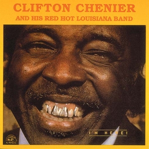
I’m not saying a DAMN thing about this album cover except to ask who hates this guy so much that they let him put this photo on the cover without so much as a “Are you SURE?”

I mean, REALLY. This is one of the most cringe-making images used to sell ANYTHING, ever. The name of this record is “I’m Here” but the artwork on this one makes you want to be anywhere BUT here. There have been countless armies of people with bad judgment putting their images on albums for decades, but none so ill-advised or poorly thought out.

It goes without saying that there wasn’t an art director on this…but I hope nobody let this one hit the shelves uncontested. Continue reading WTF: Worst Album Cover Ever?

WTFness From Waterloo-Creepiest Bad Album Art Ever?

wtf8
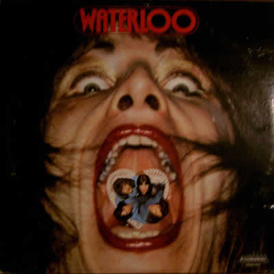
I’m not sure what to say here. The imagery from Waterloo makes me think of both Queen (no idea why) and Cannibal Holocaust. Maybe it’s because the guy has the entire band in his mouth? This album artwork begs so many double entendres it’s not even funny to think about.

The worst part about this is that deep-down Hubble telescope view of this guy’s nose. Ugh. And WTF is that inside this poor wretch’s mouth, anyway? A heart-shaped lace doily? Whatever the artist was smoking on this one, I would like a jumbo-sized pile of, please.